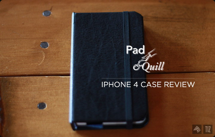
This moleskin looking iphone case by Pad & Quill was a gift from my sister (Thanks, Margaret!) I gotta admit, this is definitely one of the slickest looking cases out there. I have yet to get an actual moleskin, but this will do for now.
After using it for a few days now, here are my 2 cents:
First, the company needs a better logo. Not trying to troll here, but I definitely see room for improvement of a logo that better represents the brand. Anyway, the rest are my take on aspects relevant to the actual product.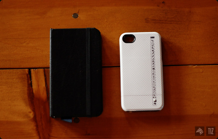
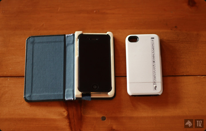
↑ Size comparison to the Uncommon case I bought awhile back. Slightly larger, still fits fine in jean pocket. I’d say similar to HTC inspire (but a tad bit thicker).
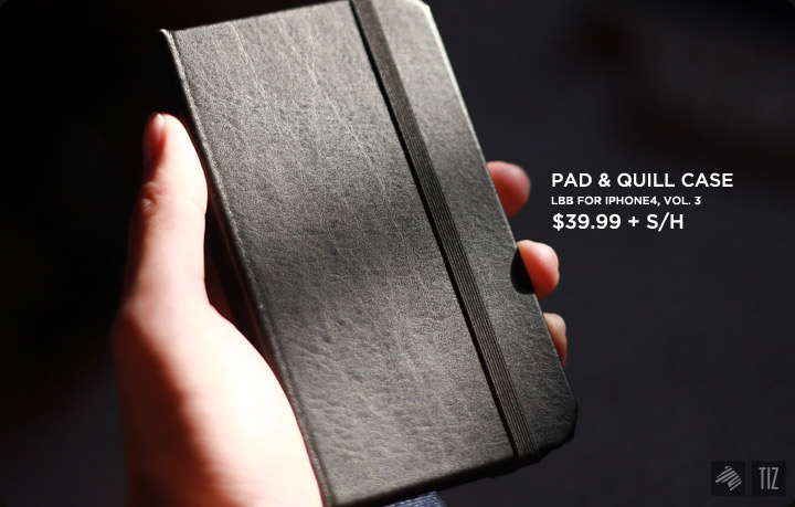
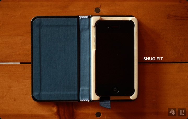
↑ Classy, isn’t it. Slightly pricey for a case. The one my sister bought is the Version 3 of their Little Black Book collection.
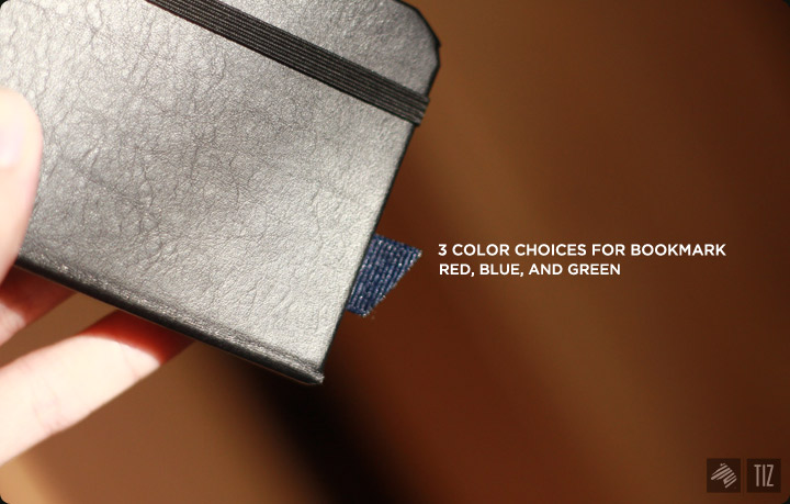
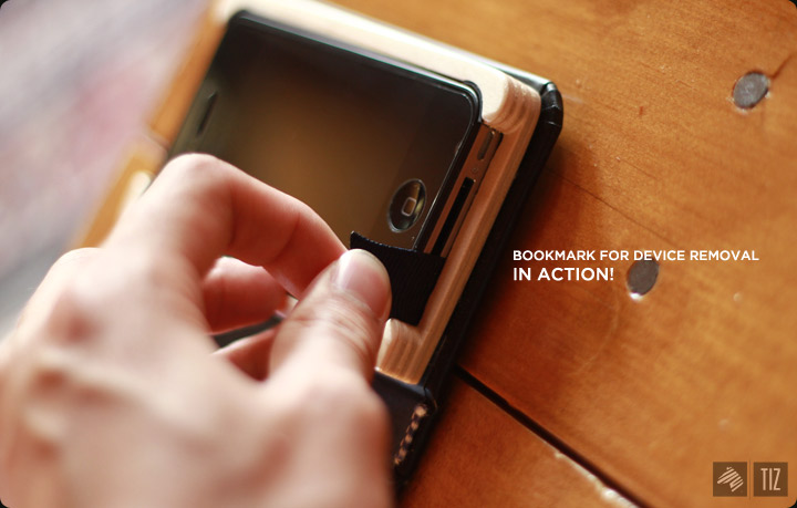
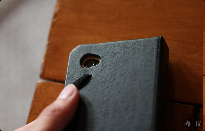
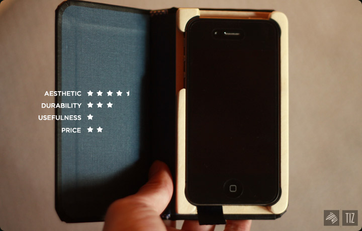
↑Bookmark comes in three different colors. I chose Blue. Now I think red looks much better.
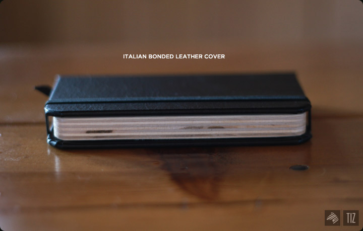
Leather
and
Wood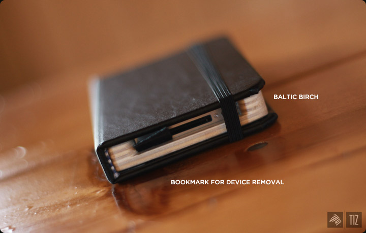
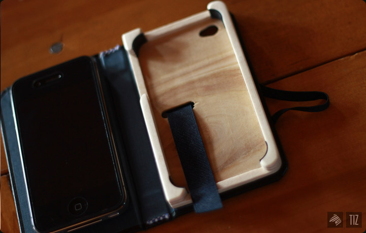
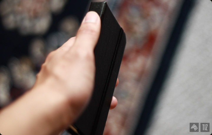
Seem like it can take a few hard hits. Screen’s covered as well.
High quality product, but with a few bad moves: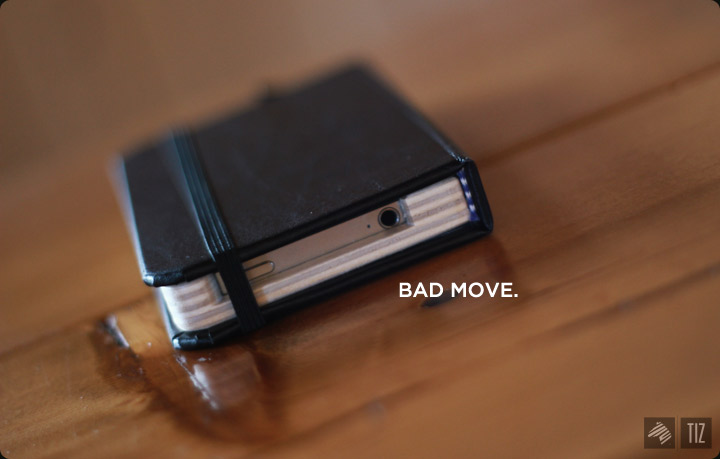
↑Worst move of all – Didn’t leave enough room for wider headphone jacks. With the spacing given, it was tight to even plug in the default Apple headphone.
Logo placement was also too large. Small and concise would’ve made the case look more intricate.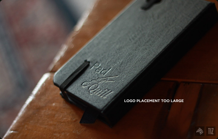
Though, the case cover serve as a stand to elevate the screen when reading..etc, it also gets in the way of holding the phone. Harmless most of the time, but can be rather irritating when playing games with precise maneuver of the phone. (Def something to get used to)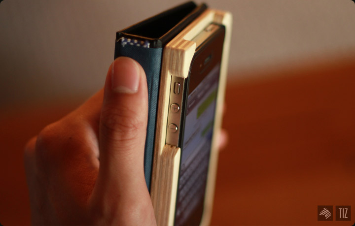
I enjoy the case, but it wouldn’t be the case of choice for primary use. It’d serve well to make things fresh every once in awhile.
til next time,
-Benson|| Twitter || the movement|| The Imaginary Zebra website || Shop of Imagination ||