It’s a great way to get a hang of CSS and HTML. (with the help of Google, of course.)
I’ve always enjoyed customizing layouts (or just things in general,) which was the core reason that made me attached to “myspace” or “my______,” as the way they call it now. The flexibility of recreating a personal web page, especially for sites like xanga, myspace, tumblr, provided me a playground to toy around with HTML and CSS (free, too.) I built a few sites so far, but I learned majority of my skills in web development via the customizable social networks.
It’s become rather common for sites today to just lay down a basic template and provide you the power to make it more personal. Tumblr, in this case, gives its users the access to almost EVERYTHING to play with. Some professional companies I know use it as the official blog – sky’s the limit to how much you can change the layout of the site to your needs. Let alone the fact that it’s almost a great platform to spread whatever it is you have to say on the site.
Anyway, I started the 365 project back in late August and I’ve been using the same layout (with minor tweaks) since. Recently, the more I looked at it, the more it bothered me. So, I made some changes. 
↑ The major problem of the theme I had: tiny images. With max-width of 500px, I don’t feel that it provides the right dimension for photographs. If I’d like to change the width of the photos, I’d also have to change the footer and header as well. Turn out, I redesigned the icons, too.
Note #1: ALWAYS save a copy of the code before you make any modifications. 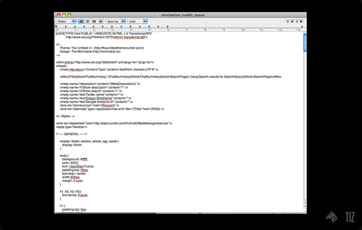
↑ I learned it the hard way back in the days.
Cool thing about Tumblr: there are thousands of themes online – if you can’t build what you like from scratch, find the one that fits closest to what you envision, then tweak to your liking.
Note #2: No matter how much you changed up the theme, credit the designer(s) that built it. You know they make life much easier. 
↑ Since I’d like to enlarge the photos when people browse through the page, I needed something serve exactly that. I came across “Boundless“, a theme by Sam Stefan, that provided me what I needed.
Simplicity’s the key. I kept in mind that I should keep the layout simple for it to last. Fancy and complex designs may be eye catchy at first glance, but people would get tired of it much quicker.
First up, I started designing the icons:
Sketch.
then to Illustrator.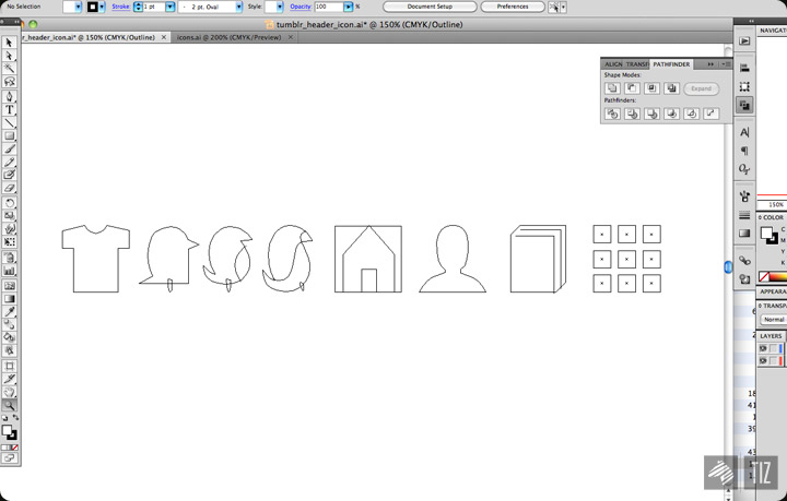
and finally: 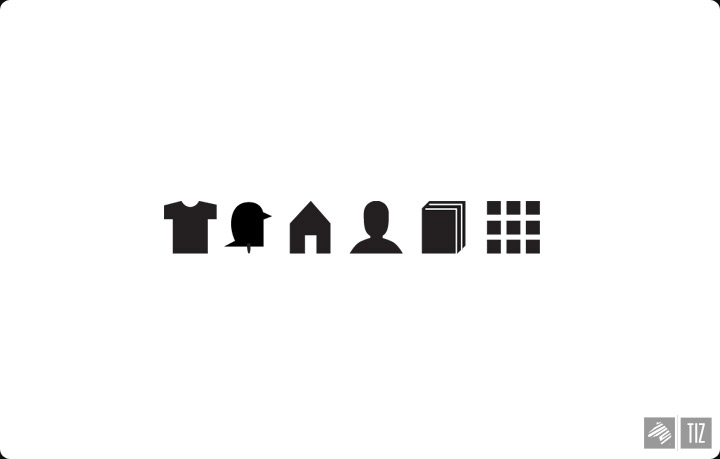
KISS. Keeping it simple, stupid.
The new header: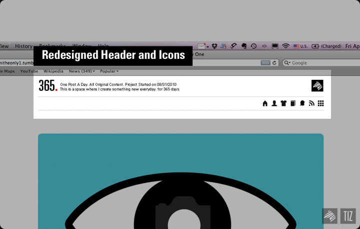
Since icons aren’t always as direct as words, I implemented some interactive features into the page to clear things up. 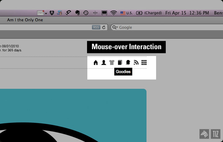
Footer V2. 
Final product: 
Here goes the [new layout for the 365 project].
[You Know You’re A Photographer When..] is a web project Cody and I did a few months ago, which you might already know. 
↑ ..but what you probably didn’t know is the “Hall of Fame,” where we post up weekly most liked quotes from the site onto [the official tumblr page of YKYAPW].
Aside for quotes, I’m also using it as my personal archive for all the cool cameras / photography related things I came across online. 
That’s it for the day.
–[365.http://theimaginaryzebra.tumblr.com/]
–[YKYAPW Hall of Fame]
’til next time,
Benson|| Twitter || the movement|| The Imaginary Zebra website || Shop of Imagination ||