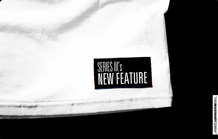
It’s been awhile since TIZ’s last drop. Thank you for your patience, for I have been working on quite a few new things for the series III. Here’s one of them – our new label design.
+Research phase.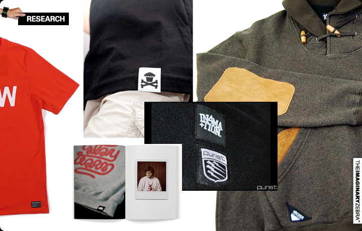
↑ I’ve done label once, but my lack of research made it a disaster; it only lasted for 1 drop. This time around, I’ve browsed online blogs/shops and physical stores to see how everyone else is doing.
The location is one of the label’s attributes: Some have it on the neck area like LRG, some have it on sleeves, and most have it at the bottom corner of the shirt. I personally prefer it to be at the bottom corner. I like the subtlety and its complement to the overall look when displaying the design.
Then, there’s the dimension of the label. Small enough to not distract the design, but big enough to fit and display its content clearly. For what I was going for, I used 1.1/8 x 1/8 inches plus the 1/8 inches seam allowance all around.
Lastly, it’s the color combination. I am not to the point where I can afford different color labels that matches different shirts I put out, yet. An uniformed color that can be suitable for EVERY color shirt is needed. Like I mentioned earlier, the labels to me area subtle complementary elements to our shirts. I ain’t going for no funky ass colors. Black with white type and graphic was my final decision.
+The idea behind the label.
↑Through the research phase, there’s one thing I realized- the labels are just another logo placement.
It’s adds detail to the shirt, but I believe they can be better. Just having another logo seems redundant.
So instead of placing a Zeebhead logo on the label, I placed my design process on it – a “what it takes to become our TIZ product” label.
+Development phase.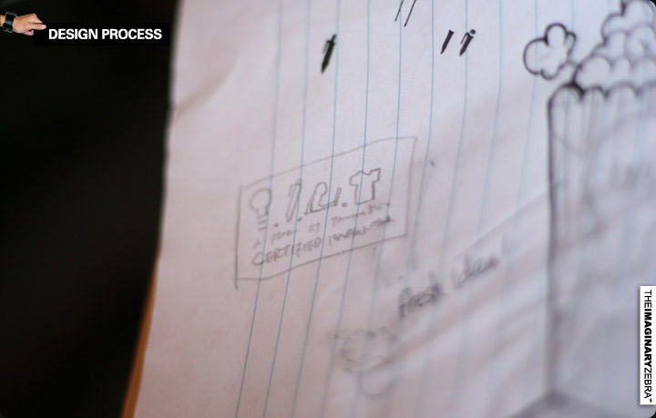
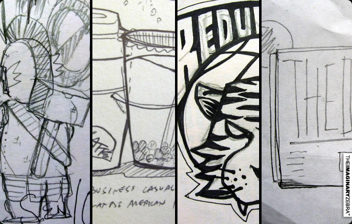
↑Rough sketch. Planning out the concept of the label.
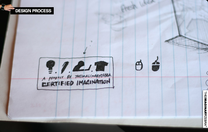
↑ Crafting and solidify the icons that stand for each phase of the “making of..” 3rd phase’s icon was confusing. It was replaced, no worries.
+Content of the Label – The 4 stages behind every shirt and product.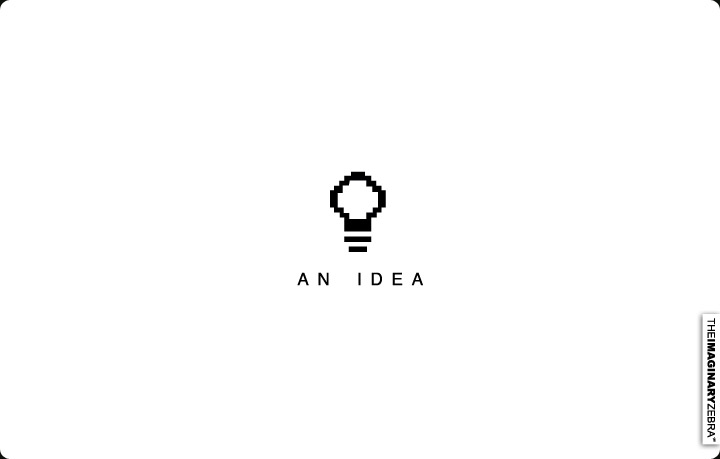
↑ Every shirt starts with an idea. Then, I’d filter many ideas into AN and THE idea for the series.

↑ Ideas come at different time, randomly. Some are contributed and inspired by others. I should’ve posted a picture of me in bed, instead. Because majority of my ideas spawn right before I sleep.

↑ Stage 2. Visualize the idea.
These are my weapons of choice. 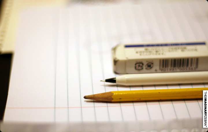
↑ The most fundamental aspect of making a design. It’s the place to experiment and eventually where I’d refine down the concept and place all the elements of a design in the right location. If I don’t spend enough time on this stage to get the details right, I’d regret it during the next step. Sketches are crucial.
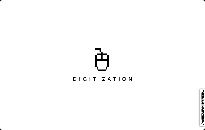
↑ Also known as the decoration stage. (in my encyclopedia.)
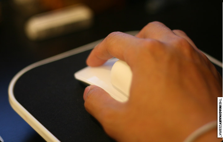
↑ Mouse all the way. Though, I heard wacom makes things easier. For the experienced, what do you think?

↑ Photoshop and Illustrator for the digitization. For most designs, I’d layout the core lines and shapes in Illustrator, then detail them with Photoshop. I used to go Photoshop SOLO, but when I was introduced to Illustrator, I saw how beautiful using the RIGHT design program can be.
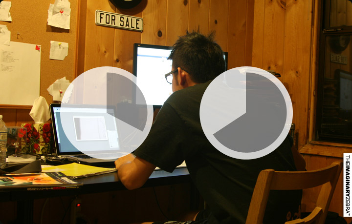
↑ This stage usually take around 4-8 hours.

↑ The last and final stage, where we get to taste the fruit of the tree of…stage 1, 2, and 3. (?) You get the drift.

+The final result
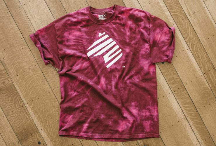
↑Every single item that we put out goes through all 4 stages to become a “certified imagination.” This is the label that will be sewn onto every single garment.


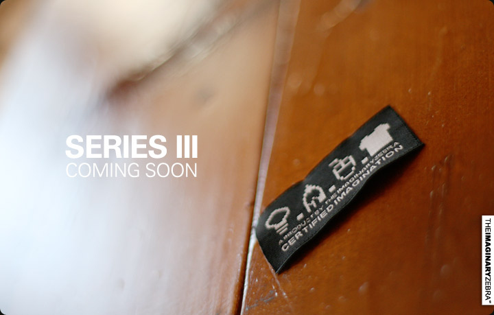
I wish that when you see this label, you would see the meaning and idea behind our apparel and would appreciate this more than a generic logo label.
Hope you like the new feature.
======================================================================== -Benson|| Twitter || the movement|| The Imaginary Zebra website || Shop of Imagination ||