Brand development and stationary design for portrait and wedding photographer from Michigan, Riutta Images.
[su_heading]Before & After[/su_heading]
Bryana Riutta picked up photography just three years ago, and has been pursuing it professionally this past year. She’s established the brand “Riutta Images” and approached us to re-envision the brand to reflect her personality and aesthetics of her work—simple, real, and filmy.

Bryana gave out a warm, cozy, yet playful vibe per our first conversation. And from looking at her work, I was quickly able to visualize the aesthetics for her brand.
[su_heading]Set the Mood[/su_heading]
This is a process that I do often, creating a mood board through online references to bring my client on the same page before I begin crafting. The mood board consists of visual elements such as typography, texture, color, and illustrations to express the direction for a brand. This is the foundation.

[su_heading]Get Inspired[/su_heading]
Her brand name is direct and focus on images, so that’s where we start off. The final brand mark utilizes the initials of the brand to make up the bracket of a viewfinder/photograph. The space between R&I also serves as a window to highlight the content of her work, letting photographs tell the stories. Finally, the color palette is inspired by the playfulness of her persona and the filmy/retro vibe from her images.

[su_heading]Sketches[/su_heading]
My favorite part of design is that there’s never a set answer. There can be ten thousands ways to draw a camera, and each one of them can all be right. Sketching is the stage where I explore those options. (There may be ten thousand ways to draw anything, but I typically do 50-100 sketches on average).

R & I & bracket alone can have many alternatives. Here’s my favorite. 
[su_heading]Guide and Placements[/su_heading]
A logo must be able to scale.

This one is particular have two placements for different applications.

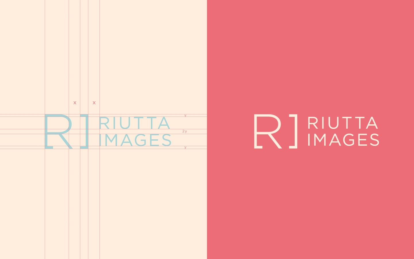

Would the logo fit a black or white background? They better. 
[su_heading]Color Palette & Typography[/su_heading]
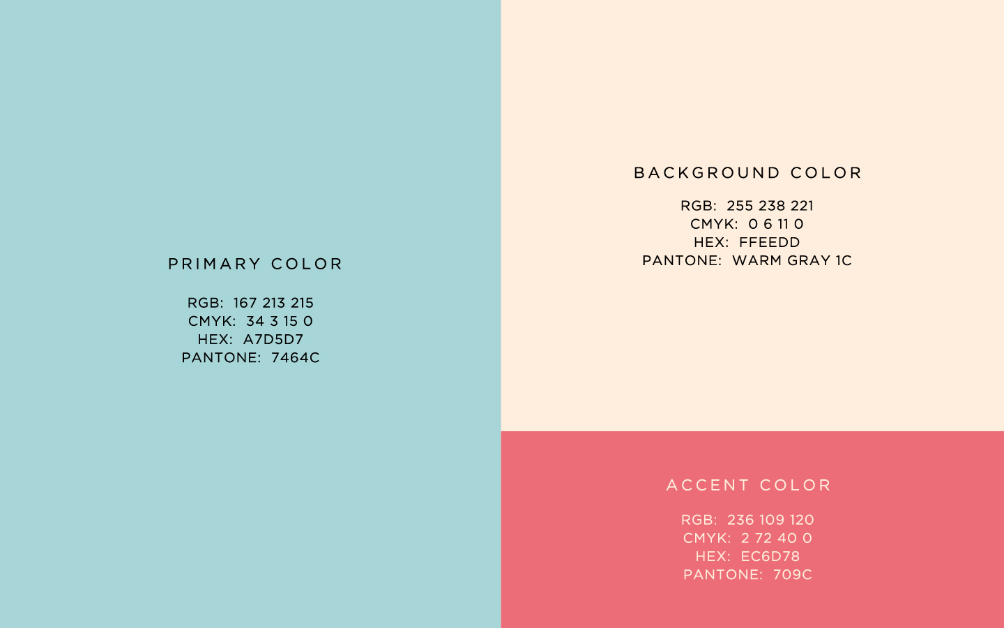
Coral and mint blue’s her favorite color, which is perfectly fitting for where the brand is going.

[su_heading]Put Things to Work[/su_heading]
This is what elevates a logo to a brand.
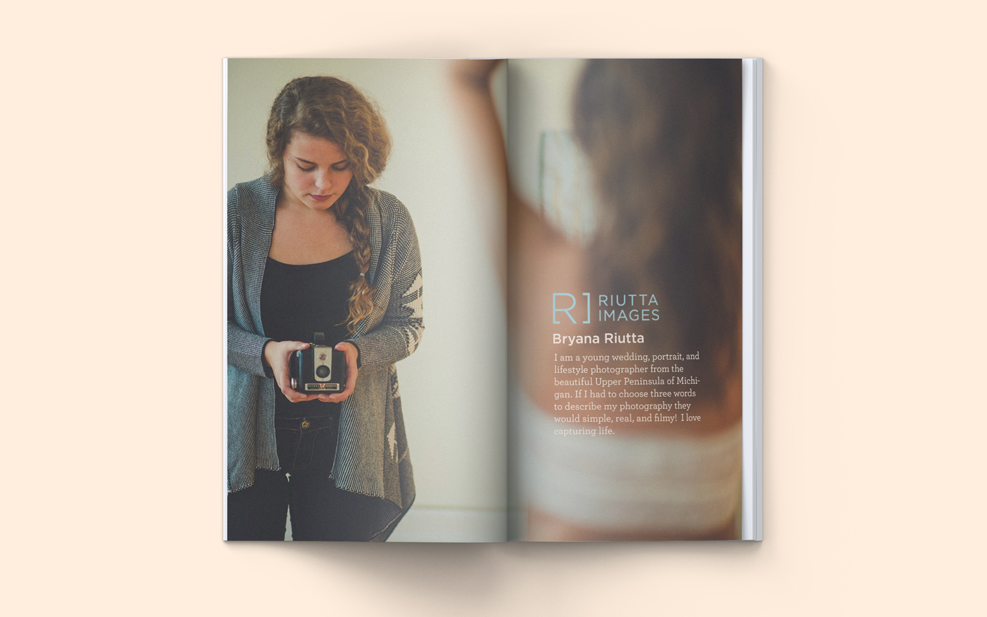
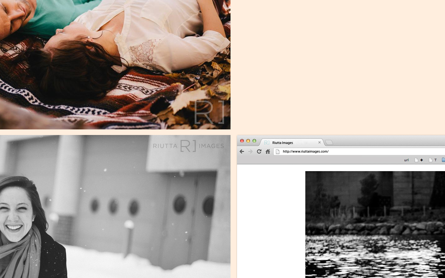
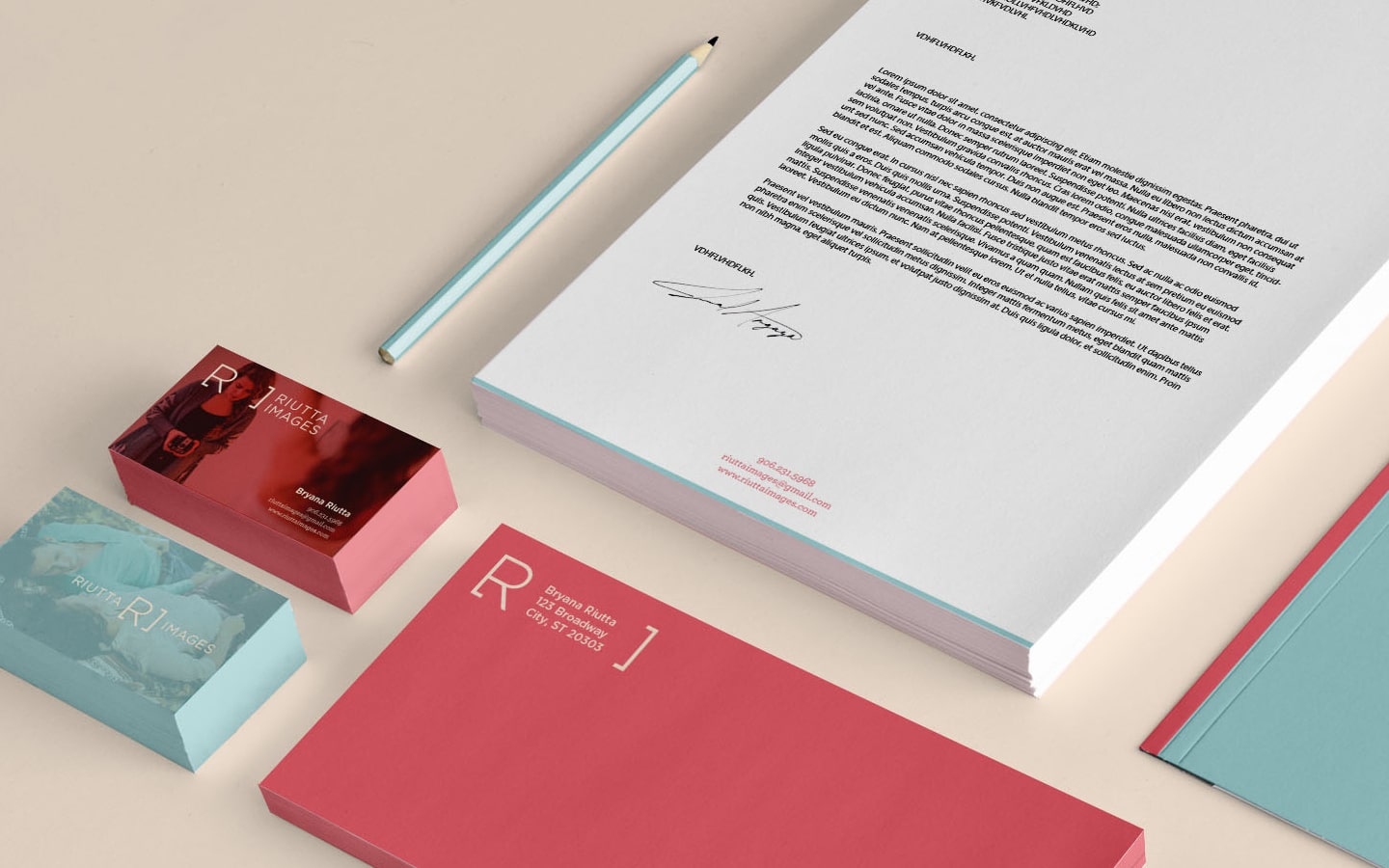
The best part of branding is applying the logo you created onto various media.
The logo should work well in different settings, and the wholeness of brand gives value to the logo. Otherwise, the logo is just a pretty standalone graphic.

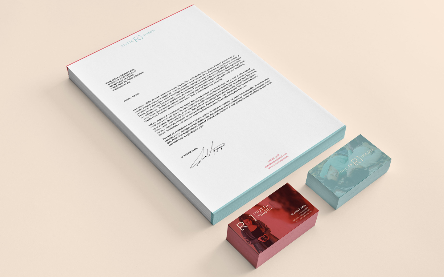


Riutta Images
Overview of the brand
’til next project,
Benson
[aside]
[/aside]


Heh, you got such a nice design portfolio, i guess you have to made a custom site where you gonna post your stuff. This is looks like this http://blogs.naturalnews.com/7-personal-development-tips-improve-quality-life/ but you will made more professionally.