
I’ve been posting snap shots of the new notebook via instagram, now it’s time for a review. Or rather, a look back at the notebooks of the past.
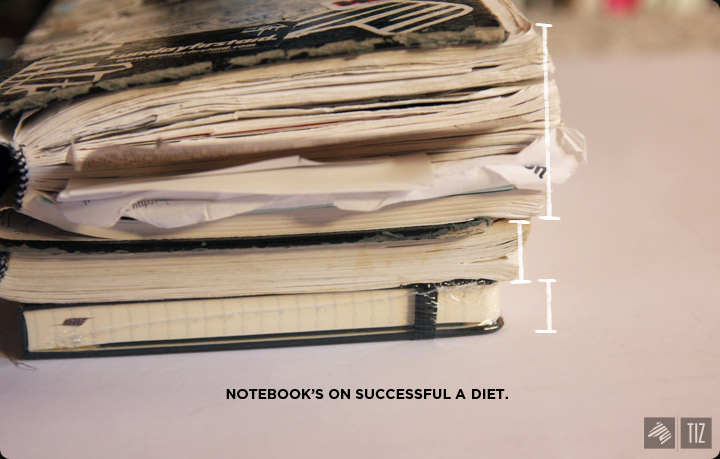
↑ Really learned to optimize the space of each page second time around. It was not a sign of half-assing my note-taking skills.
Both my sisters had the habit of bringing a journal with them when they travel (they stopped when “blogging” via the internet emerged.) So, I decided to start mine in college, except it was more like a journal for life. Sike. It was a journal for doodles. lots of doodles.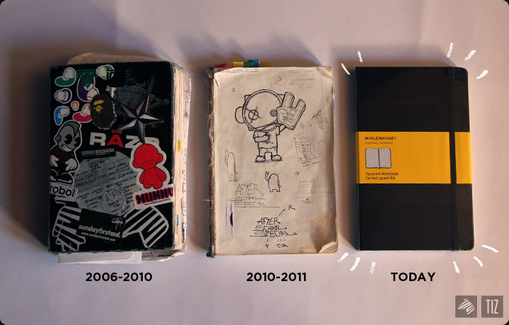
↑ I needed a hard cover for a project, which is why the 2nd notebook’s nude.
#1: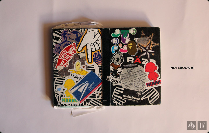
↑ Look how many zeebhead stickers I’ve wasted for the back cover.
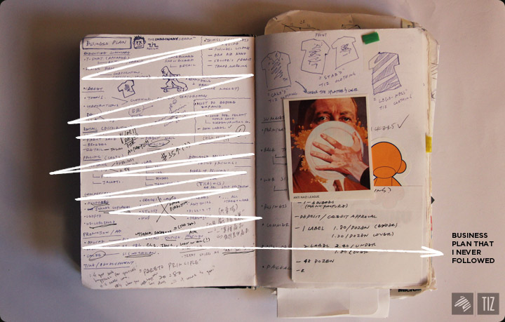
The first notebook really served as an archive. I had dozens of business cards, contact information, news press, and inspiration taped onto the pages – making it fat and hard to carry. Pieces of paper would tear from the binding as i flip through the pages.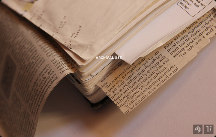
First page. It’s always been the hardest page to write on. Lots of pressure go into what deserve to be the first sketch of the book. Yet, I couldn’t believe I had a cat playing the UFO game for my first page.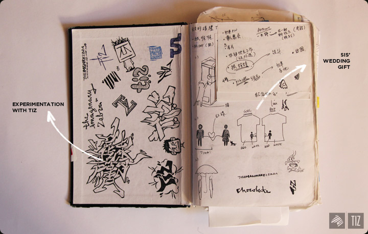
Ah, the memories.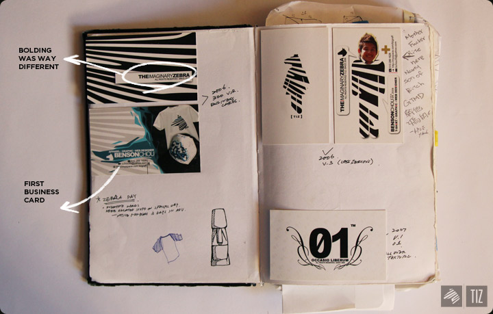
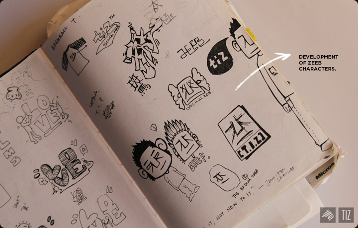
↑ The zeebhead logo I had at the time was really complex. The style of my design was drastically different, too. I liked layers a lot. apparently.
↑I screen printed a few pairs of jeans in the past (times when Evisu was the hottest shit ever) – result was never good enough for the store so that idea went out the door.
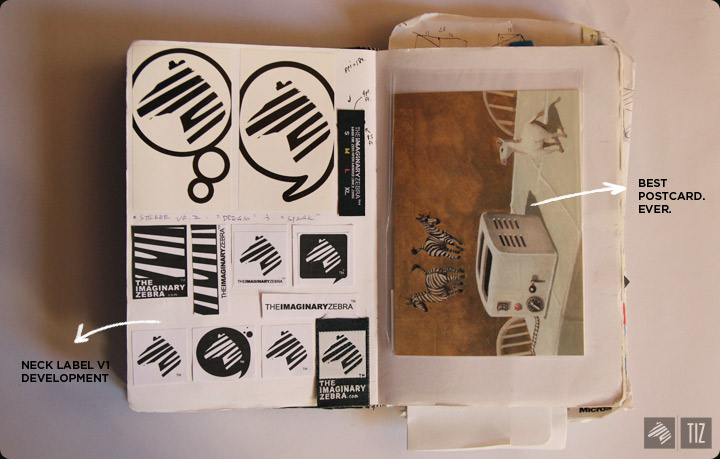
↑ I’d cut up magazine pieces and pasted it in the notebook. Today, we can find almost ANY image you see in the magazines online and store everything up in the cloud.
↑Another idea that didn’t really go through.
Phases when rhinestone’s the shit.
thanks to Kevin. We had our first news paper appearance.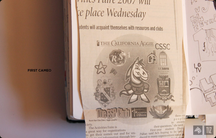
More stuff.. that I could’ve stored elsewhere.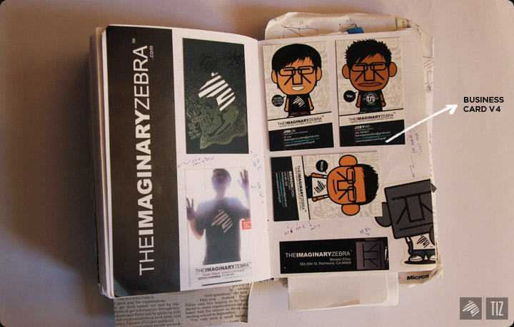
BAM, that was the first.
Now goes the 2nd: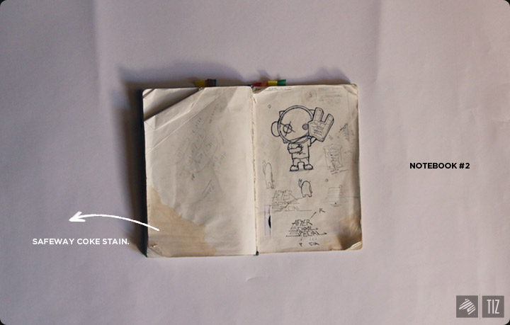
↑ This one was used strictly for ideas and sketches. Hence, the much thinner look.
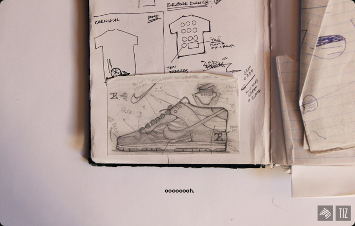
The different approaches for the AggieTV shirt.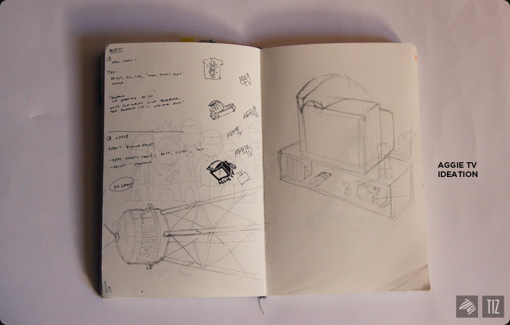
My lame attempt at industrial design: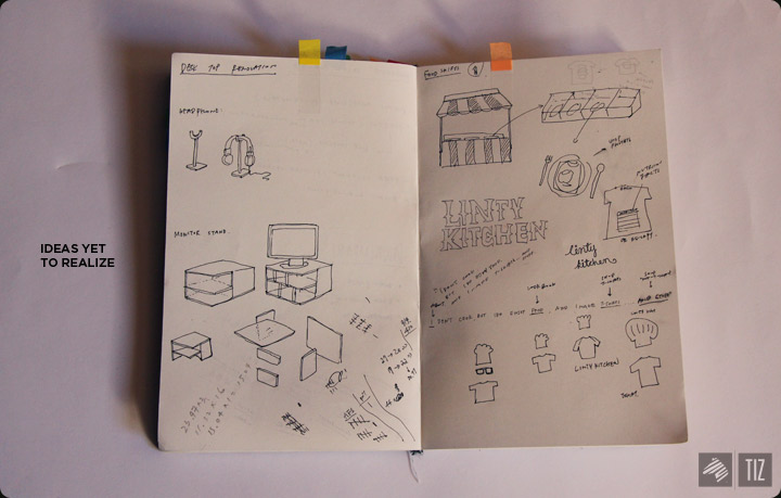
↑ An ideal monitor stand on the left and a clothing brand idea I had in mind on the right. I had the whole branding down, but never had the time to execute it.
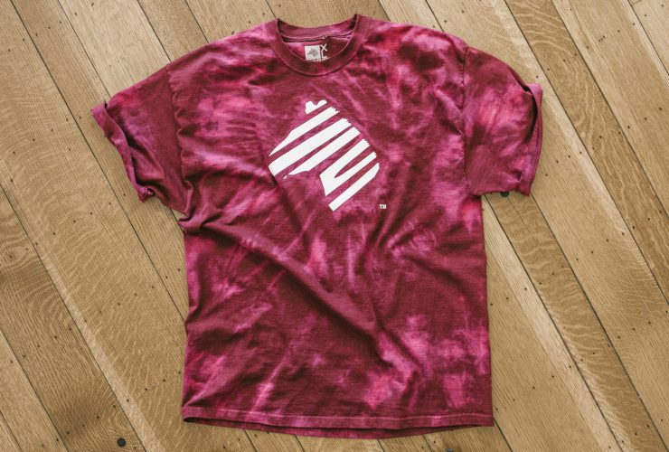
The V2 afterschoolspecial tee and AKPsi rush tee.
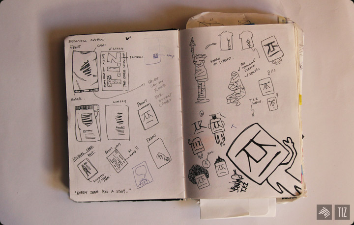
More on identities here. Logo usually take the most space out of my notebook. Here we got Melly’s and another that I cannot speak of yet.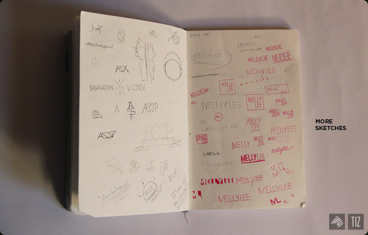
A spontaneous sketch for the project Everyday I will, an outlet for people to contribute what they’re working on and hopefully motivates others to do the same.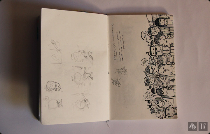
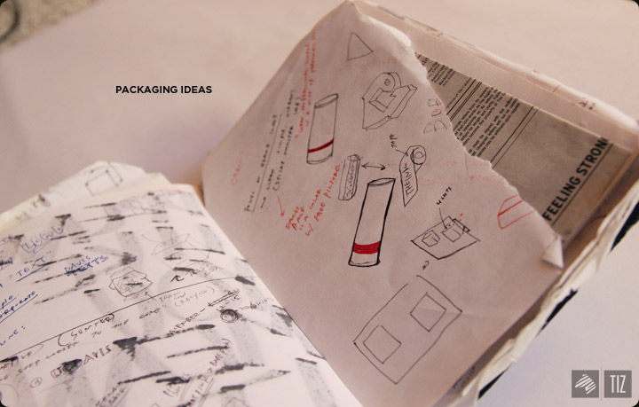
It was used as scrap papers, too, for calculation. This is the trial and error page of this project.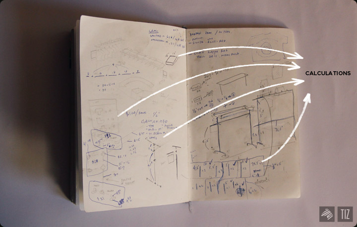
Some of my 365 ideas. Some look better on sketchbooks than the actual posts.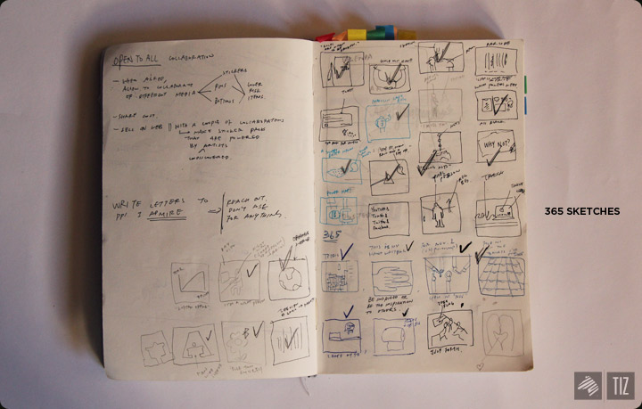
Last but not least: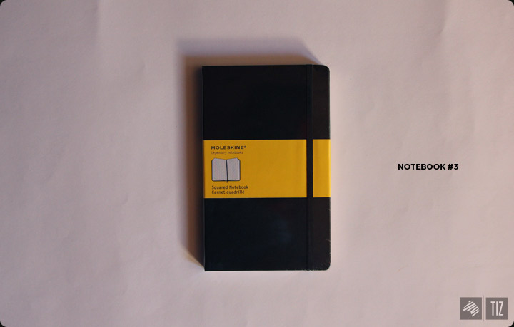
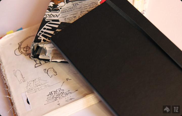
Finally got myself a moleskine. Heard lots of great things about it. It’s thin (even with 120 pages), compact, looks freaking amazing. According to Moleskine, Vincent van Gogh, Picasso, as well as Hemingway were fans of this legendary brand of notebooks. I don’t even care if it’s true because using it makes me feel like a rockstar. (Oooh Moleskine and their branding tactics.) However, they can certainly use a redesign for their site, I don’t think it quite fits the notebook’s aesthetic.
Got mine from Amazon. Moleskine’s about 20% more expensive than most notebooks of the same size.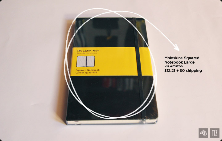
Worth it? I’m not sure. Judging from the speed I used my last one, will tell you in 6 months.
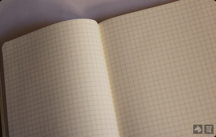
I picked the squared notebook because the grids will guide a lot of my sketches. (especially logos)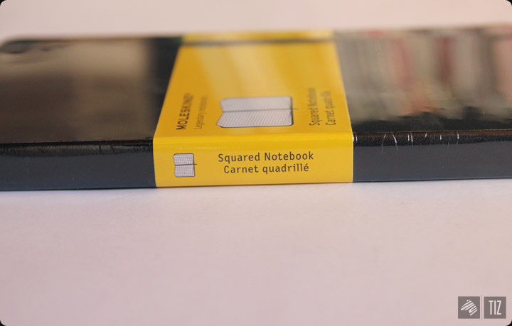
Darn, now I have to put an reward. in dollars.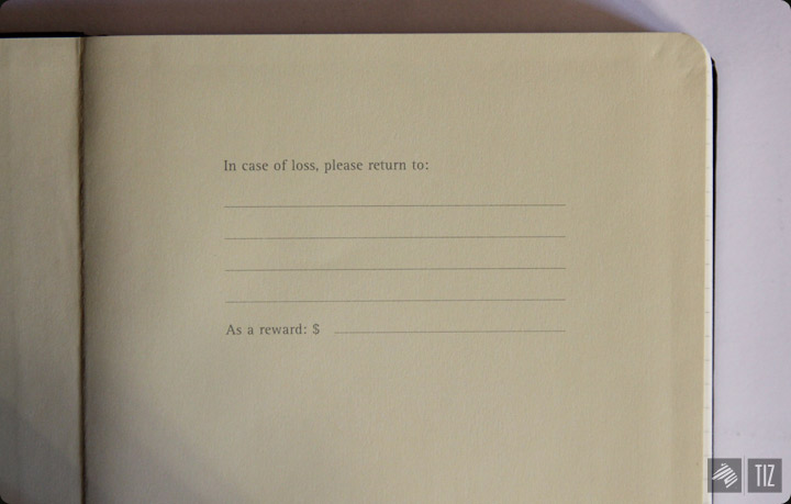
Bookmark’s a nice feature. More and more common for notebooks.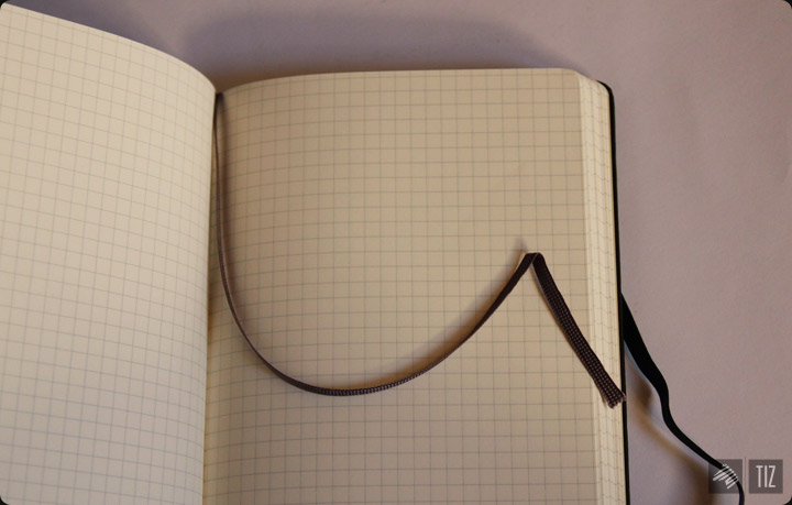
Small folder in the back.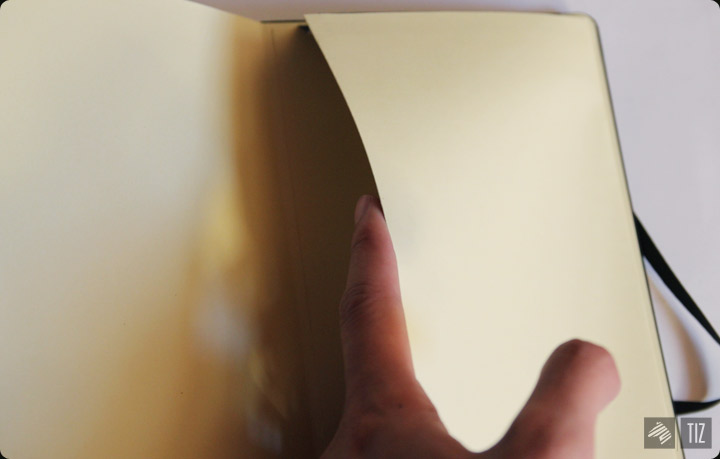
Well, that’s it. Now you know all my secrets.
’till the next kick ass product,
-Benson|| Twitter || Facebook || 365. || Shop of Imagination ||
Permalink