A logo should look good and be able to stand on its own, but that is just the tip of the iceberg.
Designers (most of them, atleast) come a long way and go through a rigorous procedures to design something that’s seemingly simple. Here’s the “behind the scene” on how this logo came about.
My Fresh Bite is an online magazine that supplies hand crafted health tips and recipes to all the fitness enthusiasts alike. They keep the interactions between the readers and clients personal and offer many encouragements along the way. It has established its online presence with over 145K followers via Instagram, and with clients such as The Game, Terrence J, Carmelo Anthony, and Lala Anthony.
The objective of the rebrand is to keep things youthful and fresh, so the brand can better resonates to the its core audience and the brand name. We introduced a new brand mark, typography, and color palette to rejuvenate the company.
The bite mark is here to stay. It’s the signature of the mark. Not only does it tie in with the brand name, it signifies freshness.

The circular shape, however, had to go. With its dimension, its takes up lot of real estate especially when the bite mark is added. The remaining circular canvas would leave little room for the company name. All words from the name should have the same weight and size, and it’s something I don’t want to compromise over. Hence, I chose a square with rounded the corners so it feels more fluid and youthful, then I simplified the bite mark into a quarter circle.
Another reason to keep the font size even:

When scaled down, you don’t want to blur out any of the company name.
The green remains the same. It’s a color that fits well with the brand and both light and dark background. 

When necessary, other color options can be implemented.
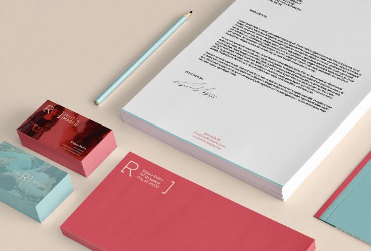
A fun and dynamic palette is provided for various applications. Nothing that shouts for attention nor too muted that carries no strength.

The square shape also leave enough room to serve as a canvas, allowing more intriguing applications. 
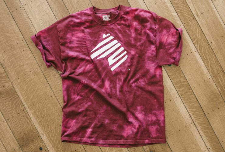
Potential ways to utilize the logo else where: 

We also touched up site: added cleaner and brighter colors, as well as repositioned some of the web elements. 


My Fresh Bite
’til next time,
Benson


