Brand development and stationary design for Canada based photographer, Derek Hui.
He wanted a logo that can reflect the film like aesthetic and artistic engagements he exerts with each project.
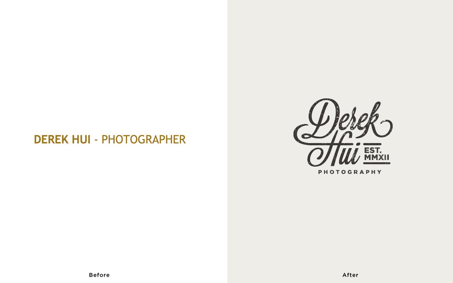
The customized hand written script embraces the natural/retro/organic essence that he wishes to convey and providing a sense of adventure.
The mark came a long way. Over the course of 70+ emails and 6 weeks, we finally nailed it.
After the first conversation, the briefing, I’d learn about the person and his/her pursuit of the career, the aesthetic that he/she like to achieve, and the value as well as story behind the brand. For brands that have a very strong and specific theme, I’d research for a mood-board to make sure we’re both on the same page. This is the mood-board I curated for Derek.
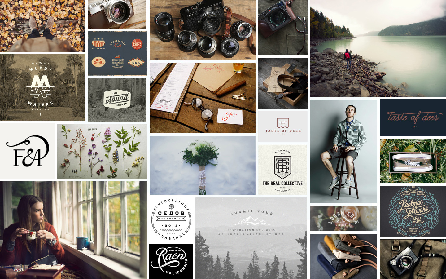
The mood-board should reflect style, color, structure, and related emotions for the brand.
Once that’s done, it’s onto papers.
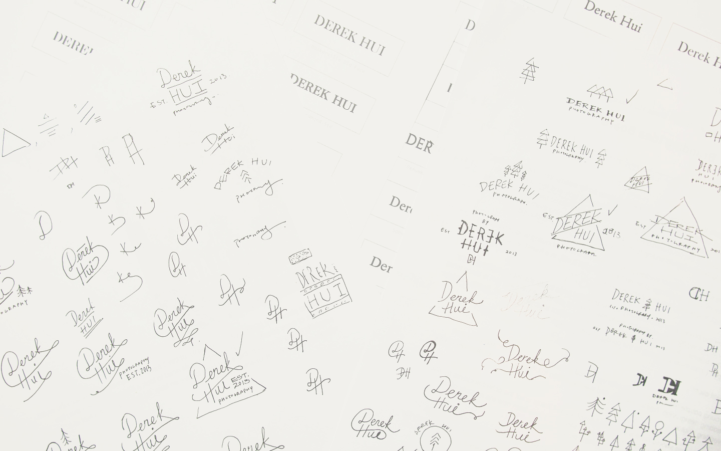
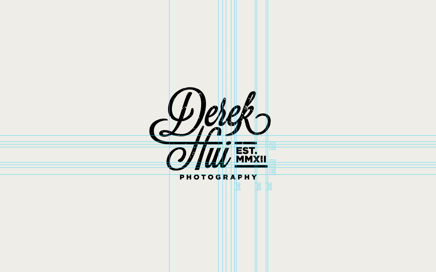
The placement of the text is one of the most prominent feature for a retro logo.
Then, digital drafts. 
And once decided on a particular direction, I’d refine it into the final mark. 
Scalability: 
Since the script may be too complex when scaled down, an alternative logo are designed to suit those needs.
Potential text placements for sub-brands or Derek’s future endeavor.


For a full view of this branding, click here.
[aside]
[/aside]

Awesome work on this one Benson.