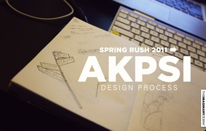
Chris and Leo approached me for this collaboration. It’s always fun to come up with a design related to their theme while retaining my style.
Background:
-AKPsi a professional business fraternity, so they were looking for something simple and professional for their upcoming rush tees.
-This theme is “Where Reality Exceeds Expectations.”
-Design should revolve around their flyer design – a street sign.
-Background: Black.
-Gold’s one of the fraternity colors. 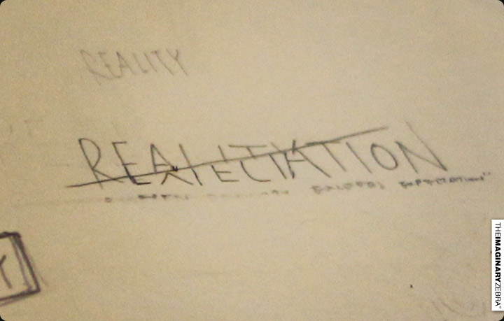
↑The first approach I tried was through texts. Texts is what usually come to mind when I want to put out simple and straight forward designs. But text can be plain, so I’d add decorations and layers to give depth to the final product.
For this particular theme, I merged “Reality” with “Expectation.” :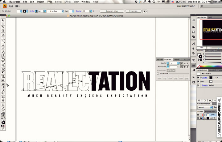
Here’s how it turned out: 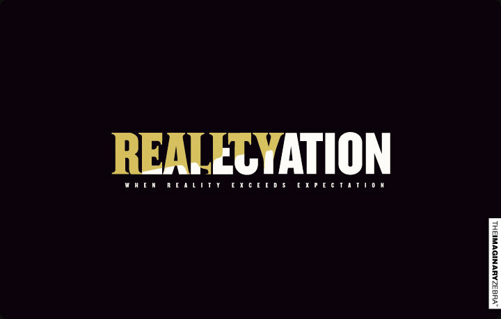
↑ It became rather confusing. It’s hard to distinguish the words and see the theme. Though, I attempted to make it work through serif/san serif fonts and colors – it’s still too difficult to pull it through.
Draft 1 didn’t work, time to move on: Design 2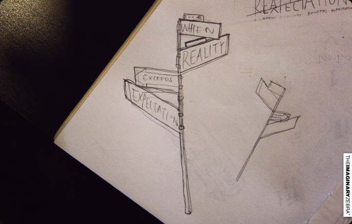
↑Maintaining the minimal style for the “professional” feel. I had to be careful with graphics – using thick lines and weird proportions may create “cartoonish” style, which is what I have to avoid for this design. Keeping things thin, yet clear to see, is the goal.
Final Design: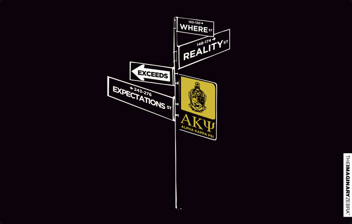
↑Using street signs (same theme as their flyer). I face the signs in different directions to create depth. The angle are kept to a minimal so the words are still legible, but enough to tell that each signs are on a different plane.
On shirts: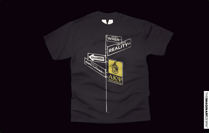
Back design: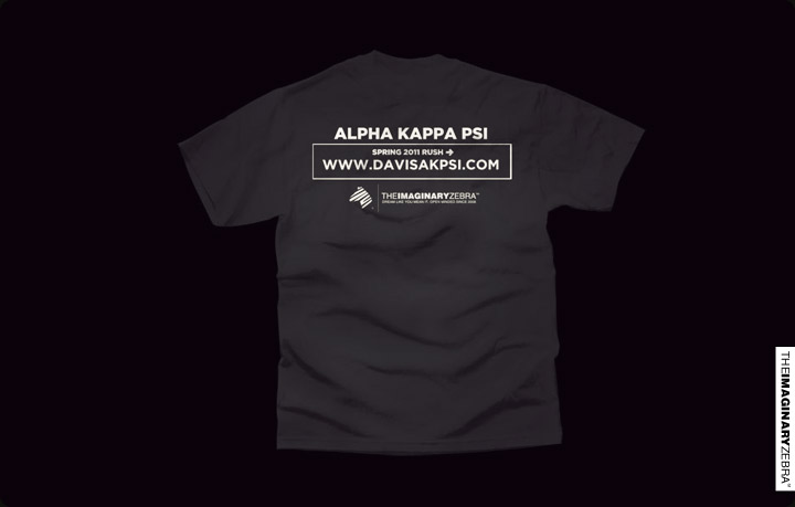
↑Using the same “street sign” theme to fit with the front.
BAM.
’til next time,
Benson|| Twitter || the movement|| The Imaginary Zebra website || Shop of Imagination ||