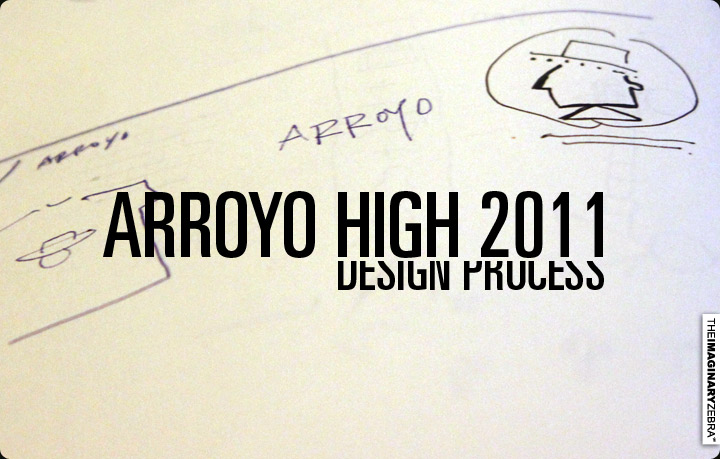
Danny from Arroyo sent me some info to get this collabo going. I get a lot of enjoyments from designing school tees, aside from getting the privilege to redesign and reinterpret their mascots, but to squeeze the most out from the limits and criteria they provide.
Here are the guidelines for this particular design given by Arroyo:
-High school name is Arroyo High School
-School colors are red/white and only those 2 colors can be used
-Sweater must be in black
-Has to be gender neutral design
-Our mascot is a don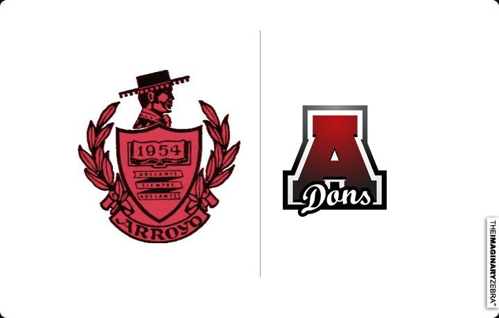
↑ Here are their current school logo/emblem.
The concept I had was to modernize the logo and make it more playful for the upcoming class of 2011.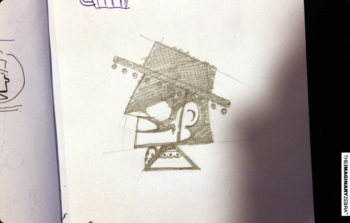
↑Given the black background and limitation to red and white for colors, I decided to stick with their original logo with its distinctive light and shadow. I also altered the face to face left because I’m used to things facing left. haha
Post edit in Illustrator after sketching. 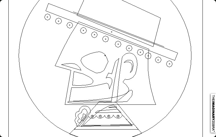
Then, move to Photoshop for further detailing. 
Final design: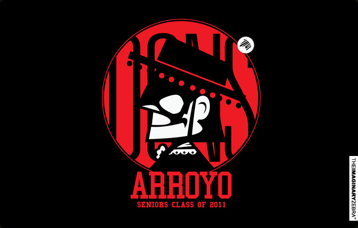
↑The circular red shape in the back help gathers the character and group the words as whole. I added “dons” subtly in the back so the red itself won’t be too bold and make the design less plain. I chose a similar font as their current logo for “Arroyo”. I didn’t adapt the gradient because it doesn’t fit well with the overall design.
The back design:
↑Back design’s meant to be simple, something that can complements the front.
Placement on shirts(I don’t have a sweater template for this , yet): 
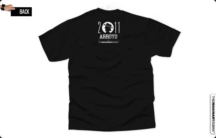
Arroyo x TIZ, done!
↑ ======================================================================== -Benson|| Twitter || the movement|| The Imaginary Zebra website || Shop of Imagination ||


