Branding development for a California based music production co., Burgundy Suite.
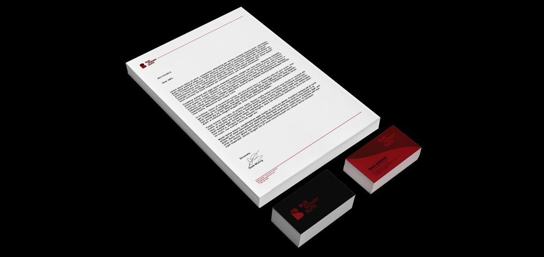
I created the brand mark using the form of “B” and the curves of “S”. The icon subtly displays both letters in a cohesive manner without shouting “B.S.”, a connotation that the client wants to avoid. For the word mark, I played around with the structure of the type. Bold and geometrical placement complements the brand mark and adds depth to the logo.

I was approached by Dale, the man behind Burgundy Suite, to take on this rebranding project. He’s decided to pursue his music driven endeavor full time and would like a new look to kickstart his company.

“Burgundy Suite” is a lengthy name, so as oppose to placing the words directly adjacent of each other, which may potentially face spacing issue due to constraints from various media, I tried either breaking down the words or have them stacking horizontally to minimize the width.

Alternative approaches that came and gone.

A modern approach for the monogram:


Several mockups of CD covers were designed to showcase the potential way to leverage the curve of the brand mark.


I’m honored to be a part of his journey. Best of luck, Dale!
Nice one.
dope. love seeing your process.