
Melly Lee is a Los Angeles, CA based photographer. She’s had the chance of working with some of the most renown YouTube artists, professional dancers, musicians, and entrepreneurs such as David Choi, Shay Carl, Cloud Campos, Mike Song, IJustine, and many more. Her quirky and creative ways of approaching her subjects not only reflects on her career in photography, but also on her work through blogs and occasional adventures.
I’ve had the opportunity of working with Melly in past for her last logo. But as she’s extending the reach of her personal brand to areas including her adventures, tutorials, and inspirations, we’ve come together to re-envision and execute a brand that can incorporate them all.
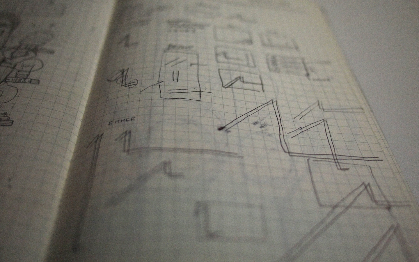
It all starts with sketches.

Unlike illustrations, all my logo sketches are fairly rough. The goal’s to explore ideas, not refining them (this part’s done in Adobe Illustrator). I’d try to come up with as many approaches as possible, given the direction of the style my client prefers (type only, minimal, gestalt, graphic..etc).
Then, I filtered the list down to only my top 3-4 choices:

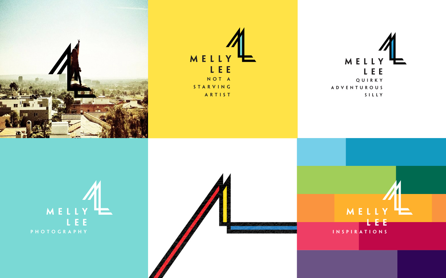
And once a particular concept is chosen, the refining comes in:

From the angle between the lines to thickness of strokes. From placement of the wordmark to spacing between the letters.
A cohesive logo find balance between all the elements.

There’s no photography symbols within the logo, although Melly’s a photographer. It’s critical that this logo can be applied in regions that may not have direct association with photography.


The logo should also be resilient.


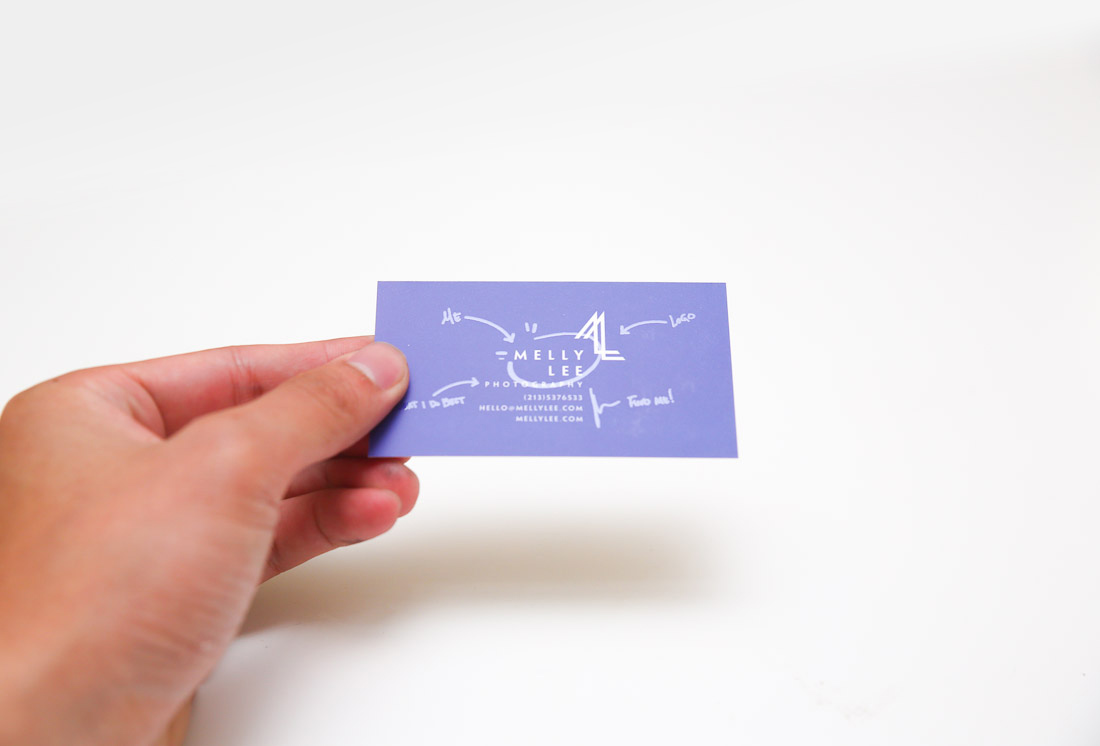
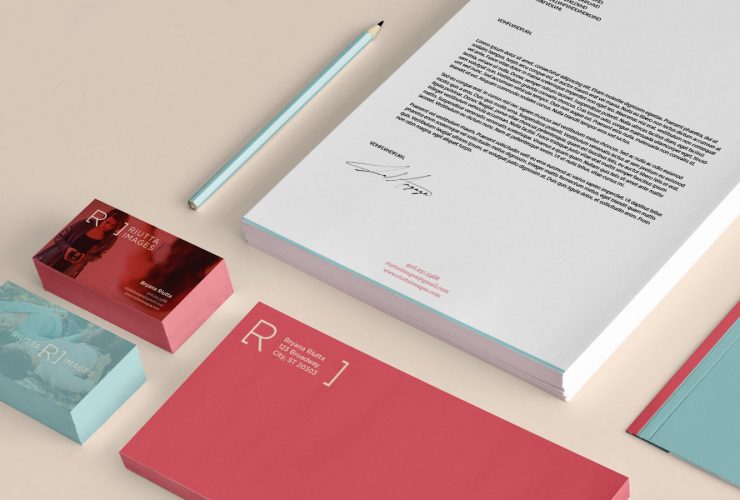
 Stationary items:
  To reflect the various styles and characters Melly is capable of, we printed 5 different sets of card, each showcase a vibrant color with a corresponding portrait Melly’s taken in the past.

Making sure that the logo doesn’t take away from the photograph, clear coat was used and is only visible at a particular angle. 


’til next project,
Benson
Permalink
Thanks Benson 🙂
Nice work! Thanks for sharing!
Holy youre freaking awesome